
A no-budgeting money app that took #1 Product of the Day twice
A personal finance app that replaces budgeting with a single number: what is safe to spend today, this week, and this month.
- mobile app ux/ui
- website design
- webflow website
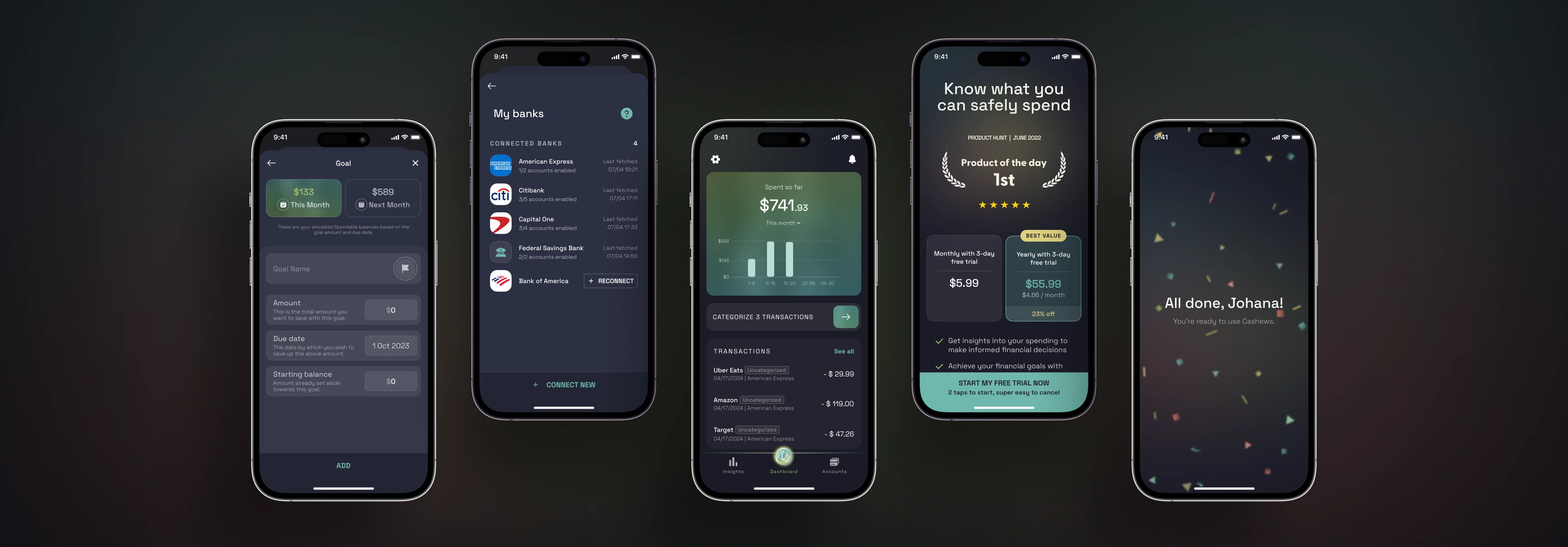
- #1 twice
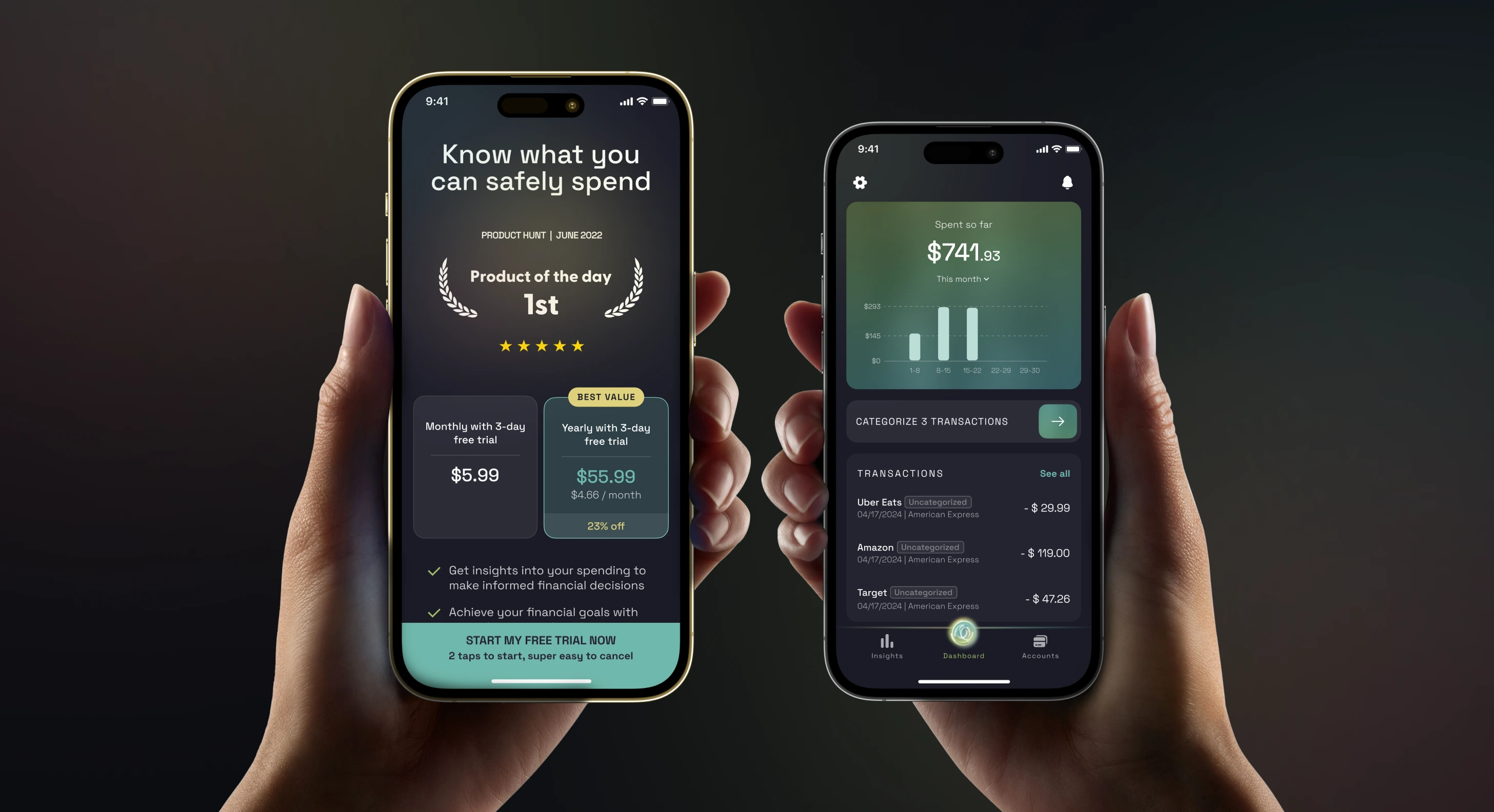
- Product of the Day on Product Hunt, thirteen months apart
- 100+ screens
- of mobile app UX and UI designed across iOS and Android
- Runner Up
- Finance Tech Product of the Year, 2023 Golden Kitty Awards
The challenge
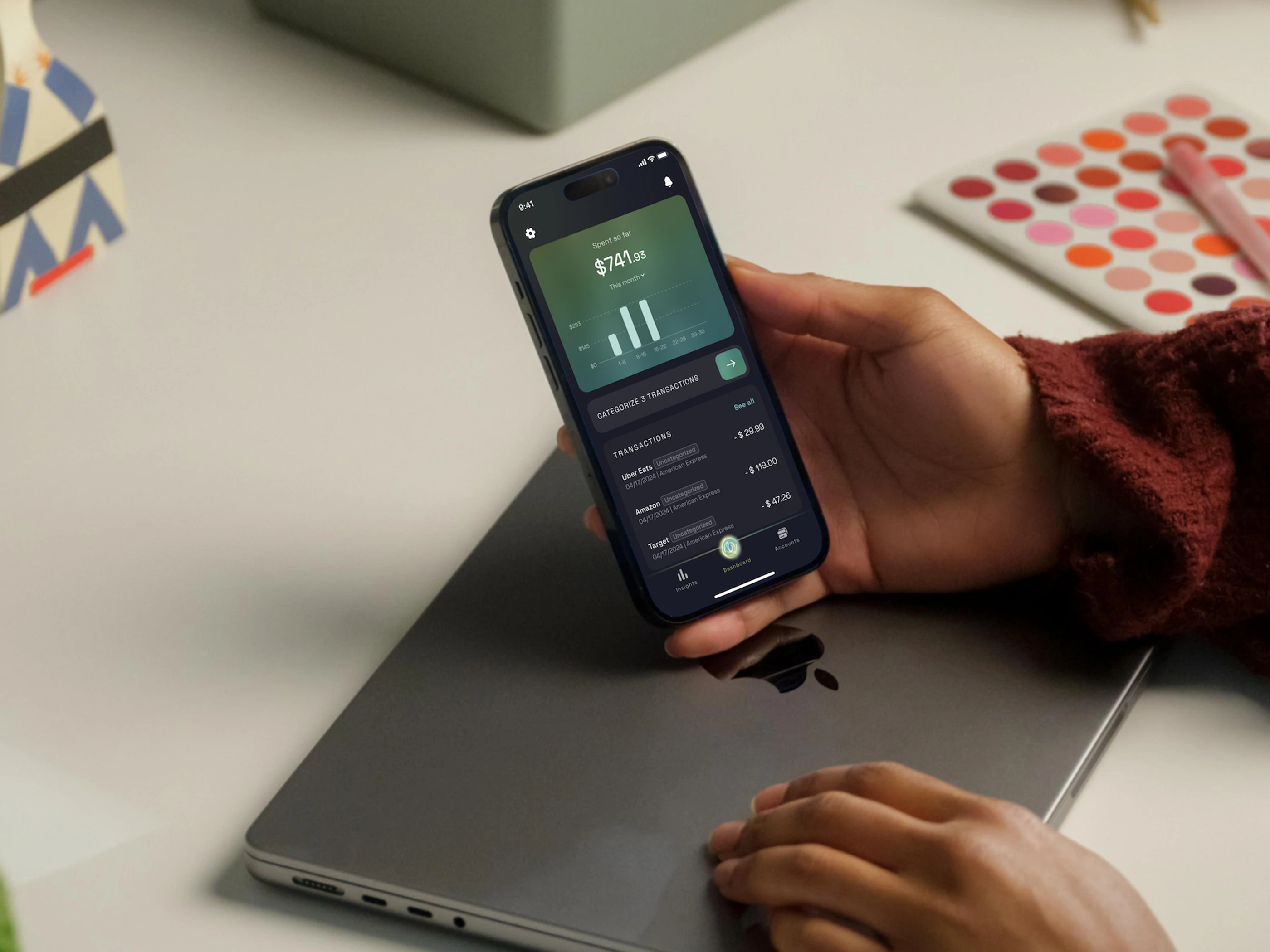
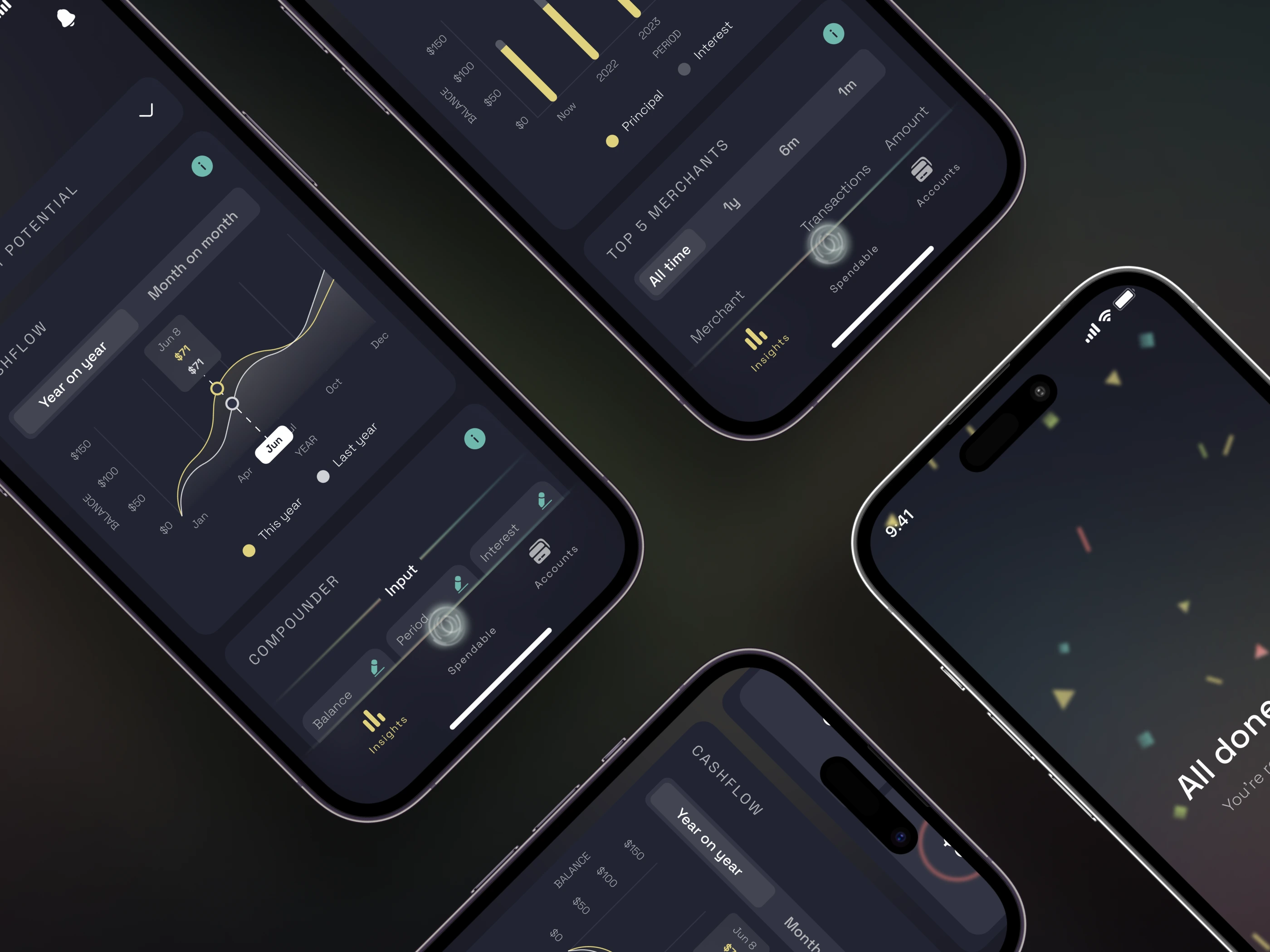
Cashews is built on the position that budgets do not work. Rather than asking someone to plan categories in advance, it reads their accounts and answers one question: what is safe to spend today, this week, and this month. That premise is easy to state and hard to draw. Almost every convention available in personal finance design assumes a budget underneath it, so category screens, envelope metaphors, and progress bars filling against a limit were all off the table. The number Cashews shows has no limit behind it. It moves as income is predicted, as recurring bills are detected, and as money is spent, and a person has to trust it enough to act on it while standing in a shop. Getting one figure to read as calm rather than as an alarm was the design problem, and there was no product to copy it from. The scope was the mobile app, the marketing website, and the Webflow build of that website, across 2022 to 2024. It was also among the studio's first product work with a US company, so the interface had to read naturally to an American user connected to American banks.
What we did
1Find the number the product is actually about
Cashews had a premise before it had an interface, and no settled answer to what a person should see first. We ran the alternatives as wireframes and clickable prototypes rather than arguing them out. Different ways of expressing what is safe to spend. Different amounts of the underlying calculation made visible. Different weight given to the day, the week, and the month. Several of those were coherent on their own terms. Only one held up once people used it. That round of exploration is why the app opens on a single figure instead of a dashboard, and it is the decision every screen after it depends on.
2Design the app around it, at roughly one hundred screens
The single figure is the easy part to draw. The screens go on everything that has to agree with it. Accounts connect and disconnect. Recurring expenses get predicted, then confirmed or corrected. Goals take money out of the spendable figure before the person ever sees it. Transactions arrive from thousands of US banks with inconsistent names and have to be sorted without turning the person into the sorter. We designed the UX and UI across the mobile app, roughly one hundred screens, for iOS and Android. The rule throughout was that no screen could contradict the number on the first one. The moment one does, the product is asking to be checked rather than trusted.
3Build the site that has to argue against budgeting
A no-budgeting app has a harder marketing page than a budgeting app, because the reader arrives with the wrong mental model and has to be talked out of it before anything else lands. We designed the website and built it in Webflow, so the team could keep rewriting that argument themselves as they learned which version of it worked. That mattered here more than usual. The product went to Product Hunt twice, in June 2022 and again in July 2023, and the site is what that audience lands on both times. It is still running on the design and the Webflow build we shipped, checked in August 2026.
4Stay on it: new features, and onboarding rebuilt
The engagement did not stop at the first launch. Cashews kept shipping through 2023 and 2024, and we kept designing inside it: UX and UI for new features, and a reworked onboarding. Onboarding is where this product is most exposed. Someone has to connect a real bank account before the app can show them anything at all, and what they get back is a number they have not learned to read yet. That work carried the app into its second Product Hunt launch in July 2023, which took first place for the day the same way the first one had.
We spent most of the engagement prototyping and testing with potential users, instead of shipping fast and learning in the market.
The obvious move is the faster one: get a first version out and let real usage settle the arguments. That works when the product resembles something people already understand. Cashews does not. It asks someone to stop budgeting and trust a single figure instead, so an early launch would have produced churn rather than an answer. Someone who does not trust the number simply leaves, and you learn that it failed without learning which part failed. Testing the models with potential users first meant the version that shipped was one we already had reason to believe would be accepted. The cost was time. What it bought was a first launch that landed.
“350life is an incredible design team. They are thoughtful, strategic, and have an eye for clean and modern design.”
 Jonathan ManuzakFounder & CEO, Cashews
What we built
- Platforms
- iOS Android Web
- Stack
- Webflow
- Timeline
- 2022 to 2024
Related work
- mobile app ui/ux
- design system
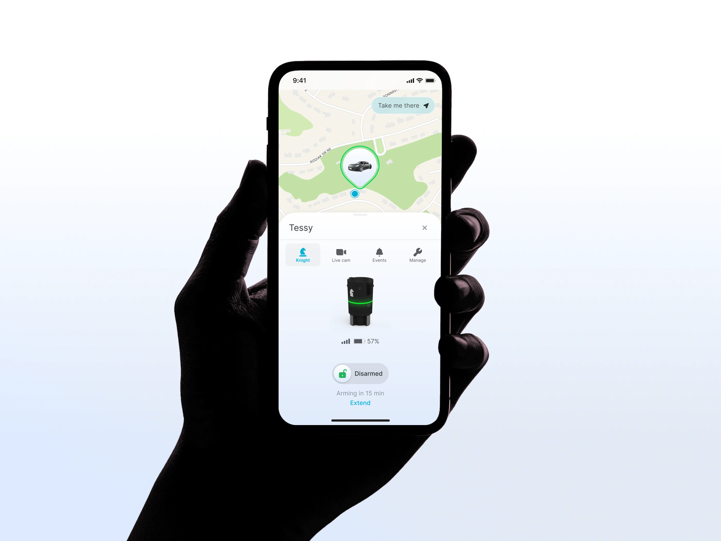
A vehicle security app still running on the interface we handed over
A vehicle security device that anchors in the car's cupholder, watches for break-ins, and sends live video to the owner's phone.
- website design
- webflow website
- mobile app ux/ui
- mobile app development
- integrations
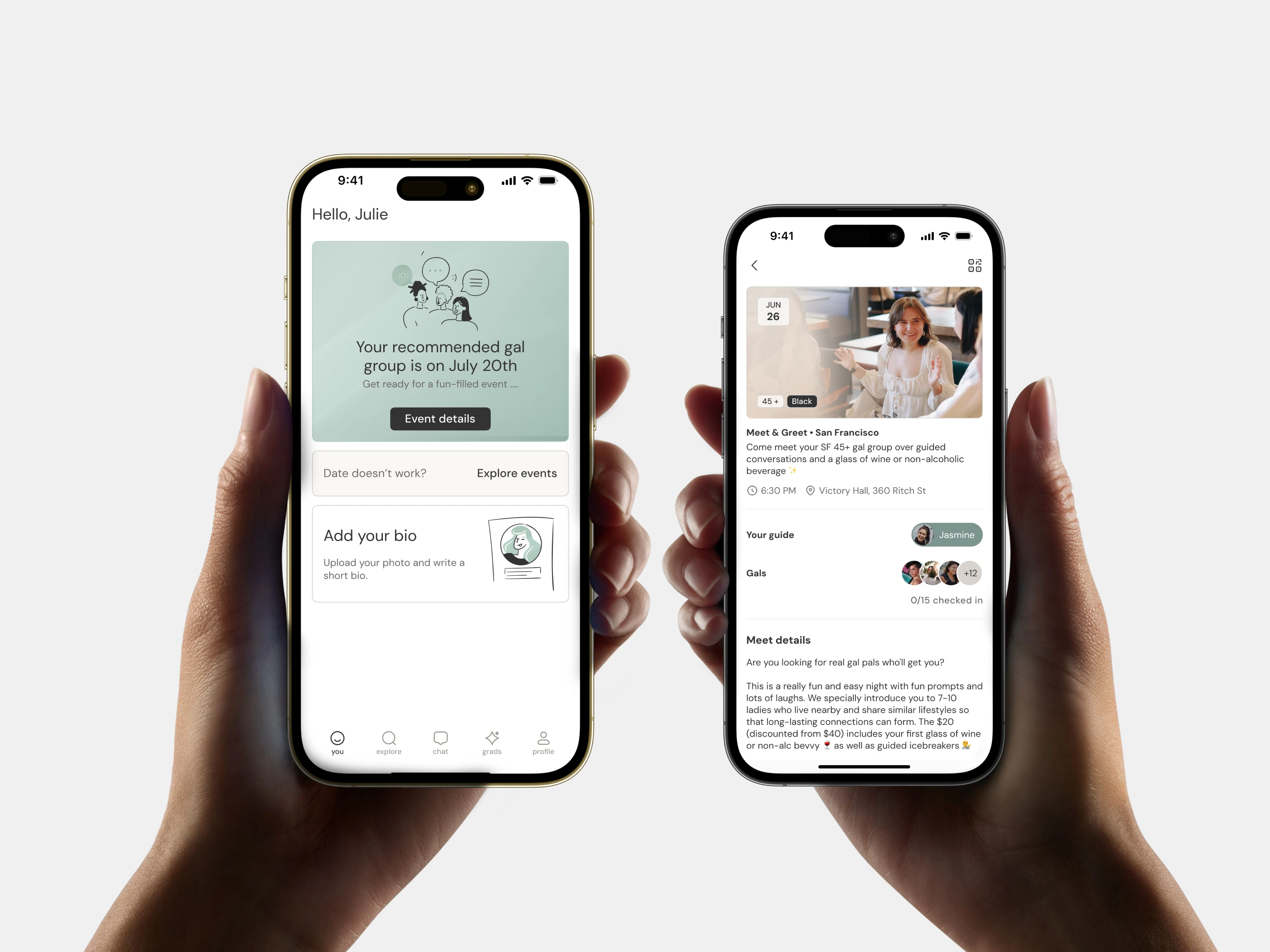
The website and app behind a YC startup at $9.4M ARR
A friendship app that matches women in the same city, then runs them through six weeks of facilitator-led meetups.
- ux/ui design
- design system
- ios app
- embedded web app
- webflow website
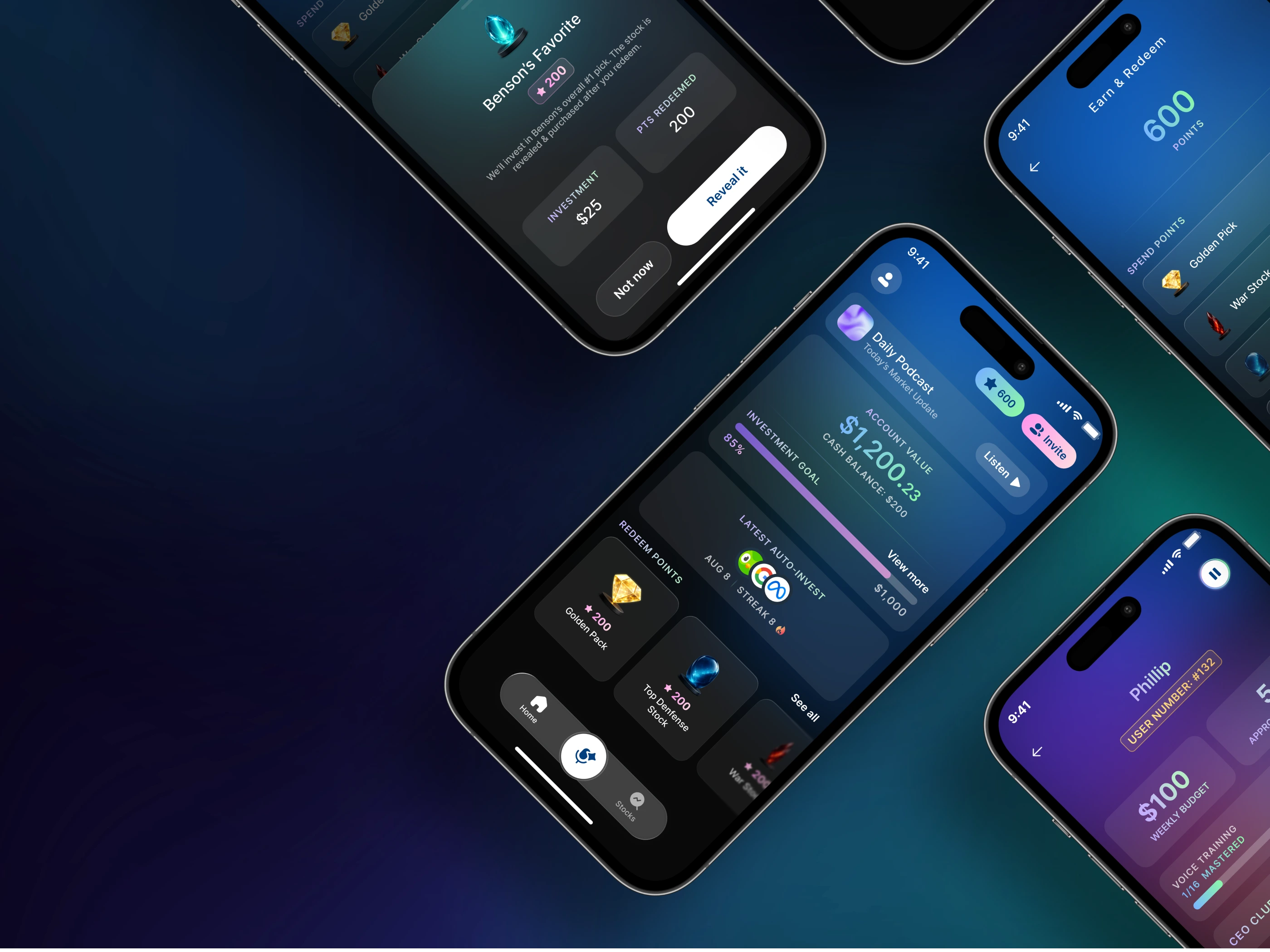
4.8 stars from 1,500 ratings for an app that invests for you every week
An investing app that picks the stocks, then invests a set weekly budget on the user's behalf.